Tuesday, 11 December 2012
First attempts at UVW mapping. The can was... pretty terrible to be honest... until i put the proper texture map on it. The shirt on the other hand worked rather well. We used a checker pattern on the mapping to get it to actualy map properly, then I made this terrible shirt design in photoshop.
This was a church design we were asked to build and texture from a pair of images we were given. I placed the two images on single planes, one with the front view, and one for the side view, and lined them up to use as references.
I also created a UV map for the main body of the church, as it was a singular object, rather than being a bunch of seperate ones pieced together, which did cause a bit of a problem...
I also created a UV map for the main body of the church, as it was a singular object, rather than being a bunch of seperate ones pieced together, which did cause a bit of a problem...
This was an experiment using the noise modifier to create asteroid shapes. I then added a basic asteriod texture and then a light source, and animated it to make it like it was a rock collision in space. It was a nice little experiment...
Monday, 10 December 2012
Perspective drawing of a gun design we were given. This was done with a biro and scanned in. The man in the background was added just as 'coolnes factor'. The gun itself was okish, with a few lines off to a wee wobble.

Troll painting based from this refernce. I knida think I need to do more work on the belly muscles, as they seem out of place... that and more on highlighting...
Monster based on line art provided by Steve. I thought it looked like a giant chicken nugget with legs... so decided to make it orange... ish
Lineart by Jordu Schell
Lineart by Jordu Schell
Thursday, 6 December 2012
Top Image: Some quick anatomy practice and a small strange unimpressed alien. I also took the chance to put the Mecha design for my game idea in a more dynamic pose, as well as doing a small quick sketch of one of the enemy mechas.
Bottom image: An attempt at some perspective work on a human. Needs a bit of work I think....
Tuesday, 4 December 2012
1 hour speedpaint of a night scene. Urgh I really am not happy with this one...
Original art was done by Sam Nielson, which we used as refernce.
Original art was done by Sam Nielson, which we used as refernce.
One hour speedpaint of an image given to us. Not finished unfortunately.
Original art was done by Sam Nielson, which we used as refernce.
Original art was done by Sam Nielson, which we used as refernce.
Monday, 3 December 2012
Tuesday, 27 November 2012
 Bug warrior... thingy... Steve gave us the original lines and process that was used to paint it, and let us try the same. This is what I came out with. I kept the lineart on at 30% on the multiply layer. It helped with defining some of the edges.etc.
This pallette was one of our references too, which we were told to use. It was a nice help when getting the right colours and shades sorted.
Steampunk/Victorian Frog. The lesson focussed on anthropormorphic design, and I decided to keep the frog's anatomy still rather frog like apart from the hip and shoulder structure, twisting it to be more humanoid. Its only slightly steampunk, with a more victorian feel. Its kinda how I like Steampunk, not over adorned with cogs gears and steel.
A smoking bug using the textures painting technique from the FengZhu tutorial we were shown. Did about 5 attempts at this... seriously fustrating...
I tried to use each of the 3 reference pictures we were given as textures behind the painting, used for colour reference and also reference on how the 'flesh' worked. I still think I made mine a bit too smooth.... but it was better than my first attempt...
I tried to use each of the 3 reference pictures we were given as textures behind the painting, used for colour reference and also reference on how the 'flesh' worked. I still think I made mine a bit too smooth.... but it was better than my first attempt...
Tuesday, 20 November 2012
Lizard Warrior done for tuesday lesson. FengZhu lineart originally, just painted over. The lighting on some of the fiddly bits like hands and feet still makes me cry but I think its probably one of the better things Ive painted..
I think the tonal value needs to be improved... Highlights primarily...
I think the tonal value needs to be improved... Highlights primarily...
Tuesday, 13 November 2012
Star Wars Land Speeder. Perspective practise. The Lineart is actually the original sketch layer just recoloured black as it shows the small amount of construction I used.
And a 2 point perspective of the USS Enterprise (bad colours I know, but I winged that). A bit of a pain, especially the engines....
And a 2 point perspective of the USS Enterprise (bad colours I know, but I winged that). A bit of a pain, especially the engines....
Tuesday, 16 October 2012
Creature feature
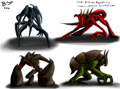
Monstas. Built up from sillhouettes.Most of the basic shapes were from me closing my eyes and scribbling before building it out.
I only thought that a couple of the shapes just.. looked bad. I stuck with four of the designs and built up a basic tonal value on them to colour using the colour layer setting in photoshop to preserve the tones.
Tuesday, 9 October 2012
Waving Robot... thing
Kit Kat mug and chick pea tin
The mug itself was mainly extrusion and dragging and rotating polys, especially on the handle.
The UV map was a bit of a pain, everytime I rendered it moved itself back to its starting position. It... seemed to fix itself though when I rendered the video.... :\
GODDAMIT MAX!
Also a tin of Chick peas. The lid of the tin was actually editted to have a bit of a ridge too.
Subscribe to:
Comments (Atom)


