Thursday, 1 May 2014

For this brief, we were told to create a small asset of a revolver from a piece of concept art. It was to be 800 triangles, and with only a 64x64 diffuse map.

I started by trying to get the main body shape of the pistol sorted, by following the exact shape of the concept artwork.
I then kept adding more parts, such as the trigger and the barrel. I actually added some extra polys along the barrel, to allow it to be animated and inflate when the gun is fired. This wouldnt be done by me for this brief. I then UV mapped it and created a small simple diffuse map of the basic colours.
I then added in the normals, with rather simple boxes and circles to give it indents and grooves. I couldnt add much more, such as any text as the detail would not show up with a 128x128 normal map. The specular map was rather simple and I believe i could have maybe done better with it, and added more glossiness.


Overall Im pretty happy with the final result, although some parts could have been much better.

For this brief we were instructed to create a piece of concept art of a tree that had character. I decided to go with a sightly fairy tale or fantasy route.
I wanted to get across the feeling of a spirit or person that had been trapped inside the tree, arms out spread and shouting to the sky. I also placed in a small 'red riding hood' like character to get across the scale. I tried a different painting style for this, with trying to keep any smoothing to a minimum. I believe it worked rather well for some of the tree trunks, but I really did not like the outcome on the leaves. Its something I have always struggled with. I also believe I could have got across the depth of the area a bit better.
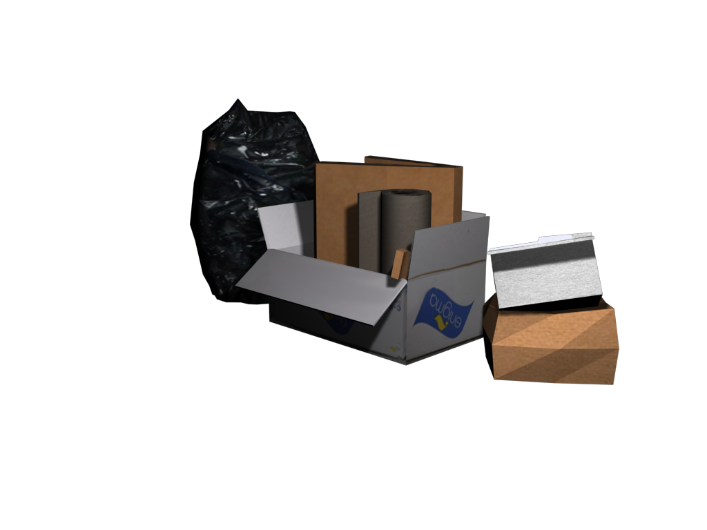
This project were told to make a set of trash from some reference photos that maxed out at 500 triangles.


This was the set of rubbish I chose to work on. The main concern for me primarily was the plastic bag, yet it actually was the folded cardboard in the centre box that gave me the most trouble. I had to compromise a little and make them be pretty solid and flat objects that I would solve through texture work.


 The textures for the boxes I was actually rather happy with. I had a little trouble fitting them to the UV map, as it was slightly skewed when I rendered it for some unknown reason, although I solved it by moving the parts slightly down to match the real UVW. I also changed the bag from slightly see through grey, to a black bin bag, as matching the different objects inside the bag would have been a major challenge. The only parts I am not super happy about are the cardboard inside the centre box. I think I could have made the textures slightly better and more detailed.

Thursday, 9 January 2014

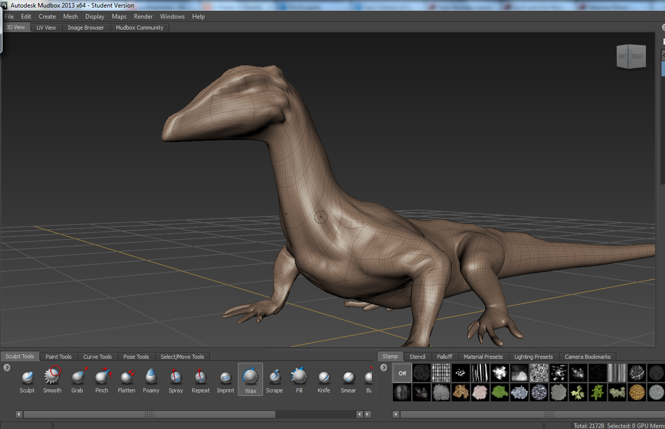
Our assignment for this project was to make a concept piece of a dragon using a 3D sculpt. We could either do a full 3D sculpt or a 2D paintover. I chose to do a paintover.

Mood board
Sketch


First WIP


Third and final sculpt WIPs
 Render

Paintover WIPs
 

Finished Concept

Wednesday, 27 November 2013

This pic was done for a Santa themed project where we had to make a Xmas card that would be given out. I struggled to get a few things I wanted on it done in time and actually plan to take it further, adding textures, the feet, numbering.etc.
I actually decided to use photoshop for this one, and tried to use a square brush. Its a start in a different direction, and one I want to see where I can take it.

Friday, 15 November 2013


A small selection of personal work I have been working on.

For this week's assignment we were given the task to create either a 2d or 3d image of something surreal.

From my research I found there was many many ways to go with this, as the concept of surrealism literally opens up millions of windows of opportunity for the wierd and wonderful. I decided to try two ideas. One a more simple style, like a newspaper cartoon, and another in the more traditional painted style.


I did a quick, if slightly crude drawing of a magpie stealing jewels with a thick brush, like a large ink pen. I then used a marker brush to get in basic colours and shading.
For my second piece, I decided to think of a wierd way of transport. I hit on the idea of driving a foot.


I had a bit of trouble trying to get the skin tones right with this one, and still think there could be a little more work with the reflections on the windows too. Yet Im pleased with the overall wierd concept.